Semiotics is the study of signs and signifying practices.
Everyday, Everybody will have signs around them and most will not even realise they are there because we are so used to seeing them everywhere, from road signs to facial expressions. There are three different types of sign: iconic, index and symbol.
Iconic.
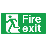
An iconic sign is something that looks like what it represents. It shares similarities with the visual meaning that it points to. For examplea roundabout sign does not look exactly like a roundabout but it has its similarities with the real thing. This also applies to a fire exit sign too.
An iconic sign is something that looks like what it represents. It shares similarities with the visual meaning that it points to. For examplea roundabout sign does not look exactly like a roundabout but it has its similarities with the real thing. This also applies to a fire exit sign too.

Index.
An Index sign has a casual link between the sign and object. For example a 'Caution wet floor' sign or a Disabled badge.Symbol.
A symbol sign is a sign where we have to learn what it means in order to understand it for example a toilet door sign and a national speed limit sign as they do not have similarities of what they point towards. We locate the meaning of a sign by the presence of signs around it.
Signs are important but mean nothing on there own because we rely on the things around them for us to understand what they mean. For example a simple cross can mean so many different things in different contexts. Although in whichever context people are familiar with it. wether it be in a grave yard, at the side of an ambulance, hanging on a flagpole or in a doctors, we know what they represent because of the various signs around them.
I understand the importance of semiotics in visual communication now and look forward to learning more about semiotics.