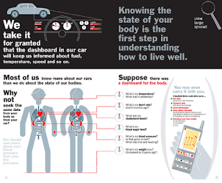
After the Designs cannons lecture I decided to research some more into information design, as I have not really learnt much about this part of design before. I realize there is a lot of complexity involved and more to information design than what meets the eye. I felt the most dominant principles in information design are consistency, grid structure, graphic elements and most importantly attention to detail. In my opinion Richard Saul Wurman applies all of these principles to his work brilliantly. He often uses pastel colours in his grid structures, which helps to navigate your way around the pages. I have also noticed that he leaves a lot of white space on his designs, which in my opinion is a good idea as it is less intimidating to read the information.

In comparison to Wurman there is David Carson, He is a well-known designer who mixes typography with different types of media. His work is quite different to all other information designers as he lets the eye work out the information being presented in a form of abstract art. Which some could argue that this does not make it design information because of the way he presents his work. He often uses photography in his work with overlapping type, which in my opinion adds a lot more interesting elements and breaks the boundaries of information design.
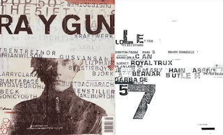
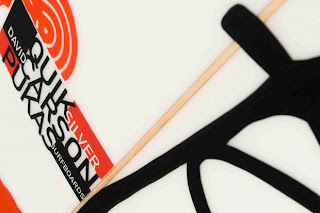
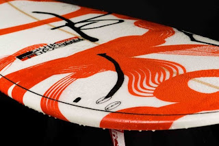
Carson is most recognized for his early work with Ray Gun magazine, it is not surprising being that David is a surfing fanatic he has now created designs for Quicksilvers new spring 2011 collection.
No comments:
Post a Comment