Friday, 1 April 2011
Philosophy of being different.
The creator of the Apple- Think Different advertisement has used a disruptive strategy to draw you in and highlight the most inspirational people of the times. These are people who have thought outside of the box and pushed boundaries and come up with inventive and original ideas.
It is important to always research other competitors as although you might not think something has been done before, It most probably has. Having this knowledge can help you to come up with different new exciting ideas. There are many artists who have different and exciting ideas to some, and not so exciting to others for example the very well known Damien Hirst and Tracey Emin. They have both been disruptive with their ideas which has lead them to be noticed by the public for good and bad reasons.
Tracey Emin in my opinion is an feminist extravert, she exposes things about herself that most people would be too ashamed to reveal to anyone let alone to the public. Subjects she has exposes include sexual nature, abortion, rape, and self-neglect. Although a lot of her work draws bad attention to her, all publicity is good publicity as it gets people talking about her and interests in her work.
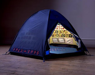
Everyone I Have Ever Slept with 1963-1995
One her installations, called Everyone I Have Ever Slept with 1963-1995 is surprisingly a tent, She has sewn inside all of the peoples names she has slept with. Some may argue that this is not art, but in my opinion how can you define art? "One mans trash is another mans treasure". Her work is bibliographical and could have almost been taken from her life's diary.
In my opinion the best of art or design is that who have gone against the grain and have thought outside the general box.
My Personal Journey.
Currently I am studying a degree in Graphic Communication at Birmingham City University. There is often days where I question myself and think am I cut out for this? Will it all be worth it in the end? The endless struggles of juggling everything that is going on around me can sometimes become daunting from keeping up with the series of lectures, blogging, talks, workshops, sketchbook work, trying your hardest to act like a human sponge, mixing all this with a completely boring part time job and trying to enjoy general life while its running so quickly. I start to question myself whether I am taking all of this information in or am I missing any important information out?
I have a photographic memory so making lists is pointless to me because 99% of the time I will not look at them again, however I love to loose myself in a good book and most of the time will absorb more information from reading a book and having photographs in front of me rather than surfing the internet through several pages and never knowing if the information you are looking at is genuine. Sadly I feel I do not have enough time to do this as often as id like to.
I find the best way I can learn is by looking around me, at past memories, Inspirational people, times of history and the different people around me and their experiences. I personally feel the over use of modern communication technology now in this day and age has changed the way people live their lives. Which in my opinion sometimes is not for the better, how much simpler would our lives be without it? Or on the other hand how would we live without it? For example my Nan quoted "you know you can send a letter on the computer? How much does it cost?" I love the idea of everybody communicating by putting pen to paper again. But is she missing out by not having knowledge from the Internet?
Thursday, 31 March 2011
Introduction to Semiotics
Semiotics is the study of signs and signifying practices.
Everyday, Everybody will have signs around them and most will not even realise they are there because we are so used to seeing them everywhere, from road signs to facial expressions. There are three different types of sign: iconic, index and symbol.
Iconic.
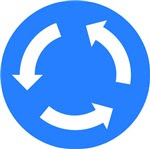
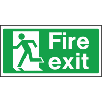
An iconic sign is something that looks like what it represents. It shares similarities with the visual meaning that it points to. For examplea roundabout sign does not look exactly like a roundabout but it has its similarities with the real thing. This also applies to a fire exit sign too.
An iconic sign is something that looks like what it represents. It shares similarities with the visual meaning that it points to. For examplea roundabout sign does not look exactly like a roundabout but it has its similarities with the real thing. This also applies to a fire exit sign too.
Index.
An Index sign has a casual link between the sign and object. For example a 'Caution wet floor' sign or a Disabled badge.Symbol.
A symbol sign is a sign where we have to learn what it means in order to understand it for example a toilet door sign and a national speed limit sign as they do not have similarities of what they point towards. We locate the meaning of a sign by the presence of signs around it.
Signs are important but mean nothing on there own because we rely on the things around them for us to understand what they mean. For example a simple cross can mean so many different things in different contexts. Although in whichever context people are familiar with it. wether it be in a grave yard, at the side of an ambulance, hanging on a flagpole or in a doctors, we know what they represent because of the various signs around them.
I understand the importance of semiotics in visual communication now and look forward to learning more about semiotics.
Friday, 25 March 2011
Motion Graphics.
The Design for digital lecture with Rob Tovey (a researcher at the cambridge school of art) in my opinion was the most interesting and inspiring lecture yet. He put motion graphics into simple terms and presented a wide range of different motion graphics, good and bad. Motion graphics is simply graphic design that moves, They typically feature sound because sound anchors the meaning.Their are two different types of motiongraphics, Animation and film. But what is the difference? Animation is manugraphic meaning they are open to the viewers interpretation of something and film is photographic meaning it is what you see. However sound anchors their meaning, showing you how they are meant to be understood.
Coleridge: the suspension of disbelief
Definition
the suspension of disbelief is an effect where by an audience accepts what happens within a narrative unquestioningly, despite the implausibility of the narrative
or the limitations of the medium.
Motion Graphics use different framing modes, one being diegetic mode and the other mimetic mode.
Diegetic mode - The audience is told whats going on normally by an authorial voice.
Mimetic mode - The audience is shown whats going on therefore they are invited to suspend disbelief.
Although the majority of motion graphics have diegetic content there are some out there with mimetic content however, very few. We see more and more motion graphics around today than ever as it is used not just in film credit and titles etc. but TV idents too
which are becoming more popular because they reinforce the brand association and remind the viewer what channel there watching. In my opinion Channel 4, More 4 and BBC have the most interesting Idents.


In my opinion Channel 4 and More 4 have used a little bit of diegetic and mimetic as you are shown what is going on however they are inviting the audience to suspend disbelief as it is almost like a collage of photographs together, you are told by an authorial voice what you are about to watch but not what is happening in the motion graphics.
Our brief from Rob was to create an American educations sho
w for children that is based around a character called Brainiac Jack. The show would teach children about different historical facts by using Brainiac Jack as a super hero that encounters a variety of historical times and figures. My interpretation of Brainiac Jack is that he is an alien landing from outer space, landing in different historical times and learning about them on his journey. I chose to use an alien like figure because in my opinion it is something children are familiar with and is a friendly figure. It also adds humour because it is completely unbelievable and is completely mimetic.

I created a short storyboard which I found to be quite hard to get across what was happening in the scenes and can now fully appreciate the amount of work that goes into creating short motion graphics.
Thursday, 24 March 2011
Information Design.
Information design is everywhere in everyday life, even if we do not notice it.
After the Designs cannons lecture I decided to research some more into information design, as I have not really learnt much about this part of design before. I realize there is a lot of complexity involved and more to information design than what meets the eye. I felt the most dominant principles in information design are consistency, grid structure, graphic elements and most importantly attention to detail. In my opinion Richard Saul Wurman applies all of these principles to his work brilliantly. He often uses pastel colours in his grid structures, which helps to navigate your way around the pages. I have also noticed that he leaves a lot of white space on his designs, which in my opinion is a good idea as it is less intimidating to read the information.

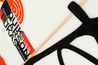
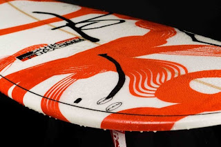
In comparison to Wurman there is David Carson, He is a well-known designer who mixes typography with different types of media. His work is quite different to all other information designers as he lets the eye work out the information being presented in a form of abstract art. Which some could argue that this does not make it design information because of the way he presents his work. He often uses photography in his work with overlapping type, which in my opinion adds a lot more interesting elements and breaks the boundaries of information design.
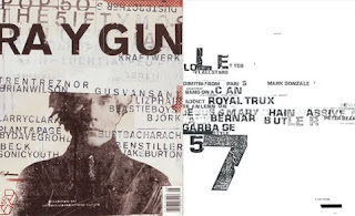
Carson is most recognized for his early work with Ray Gun magazine, it is not surprising being that David is a surfing fanatic he has now created designs for Quicksilvers new spring 2011 collection.
Subscribe to:
Posts (Atom)